PR agency Lamb to Slaughter commissioned me to rebrand their expanding company, based in Dalston. The redesign centred around their annual press day, where they showcase their current client list.

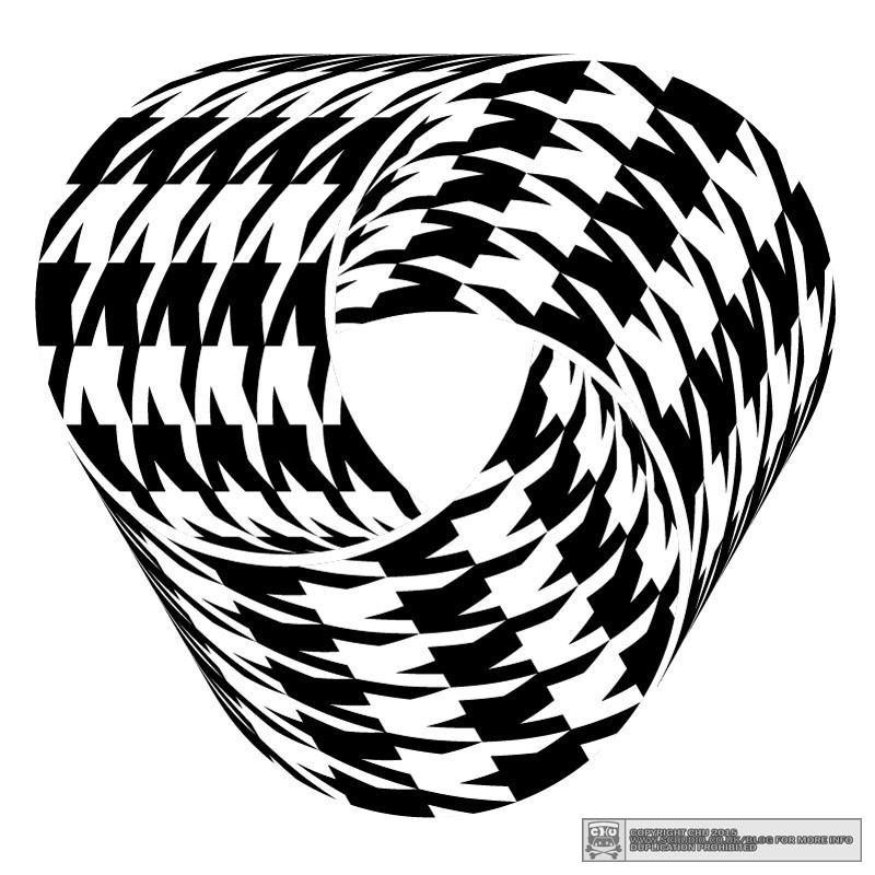
Their new logo is a rehash of the washing symbol for a woollen item, cross-bred with the infamous Scottish dogtooth (or lambstooth, depending…) repeat pattern print.
These two devices are both references to the wonderful proprietor (my better half), Donna’s second name; LAMBert – and that the Lamb to Slaughter agency have a lot of textile-fashion-centric clients.
Oh, and Donna knows a thing or two about retail, helping to revive notable shopping areas such as Carnaby Street in central London and the Boxpark complex in Shoreditch.


